


Caffirmations is a brand that infuses every morning with vibrant, joyful, and inspirational energy. Inspired by the infectious energy of that person at the café who lifts the room, Caffirmations embodies an inner playlist of golden moments and feel-good vibes. The brand’s mission is to transform every day into an opportunity for self-expression and empowerment, encouraging individuals to hit play on their day and embrace positivity at every turn. Caffirmations aims to spark inspiration, making each moment a chance to inspire and uplift those around you.
My role was to create the brand identity for this exciting new venture, capturing its essence of energy, joy, and empowerment through thoughtful design. The goal was to bring Caffirmations' vision to life in a way that would motivate people to turn up the volume on life, making each day feel like the best part of their playlist, and inspiring the world to dance along.
Brand Challenge:
The key challenge with Caffirmations was creating a versatile logo suite that worked across different formats. The long name posed a particular difficulty in adapting to various sizes and orientations. A horizontal logo was not always suitable, so I needed to design a secondary logo that would fit into square or vertical layouts without losing impact.
Additionally, while the Caffirmations team knew what they didn’t want, they weren’t sure what they were looking for initially. This made the process more iterative and required a significant amount of study and exploration in typography to develop a design that was both unique and effective.
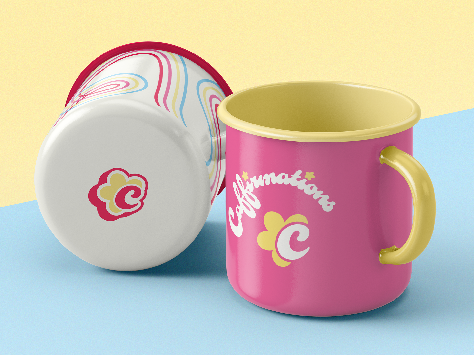
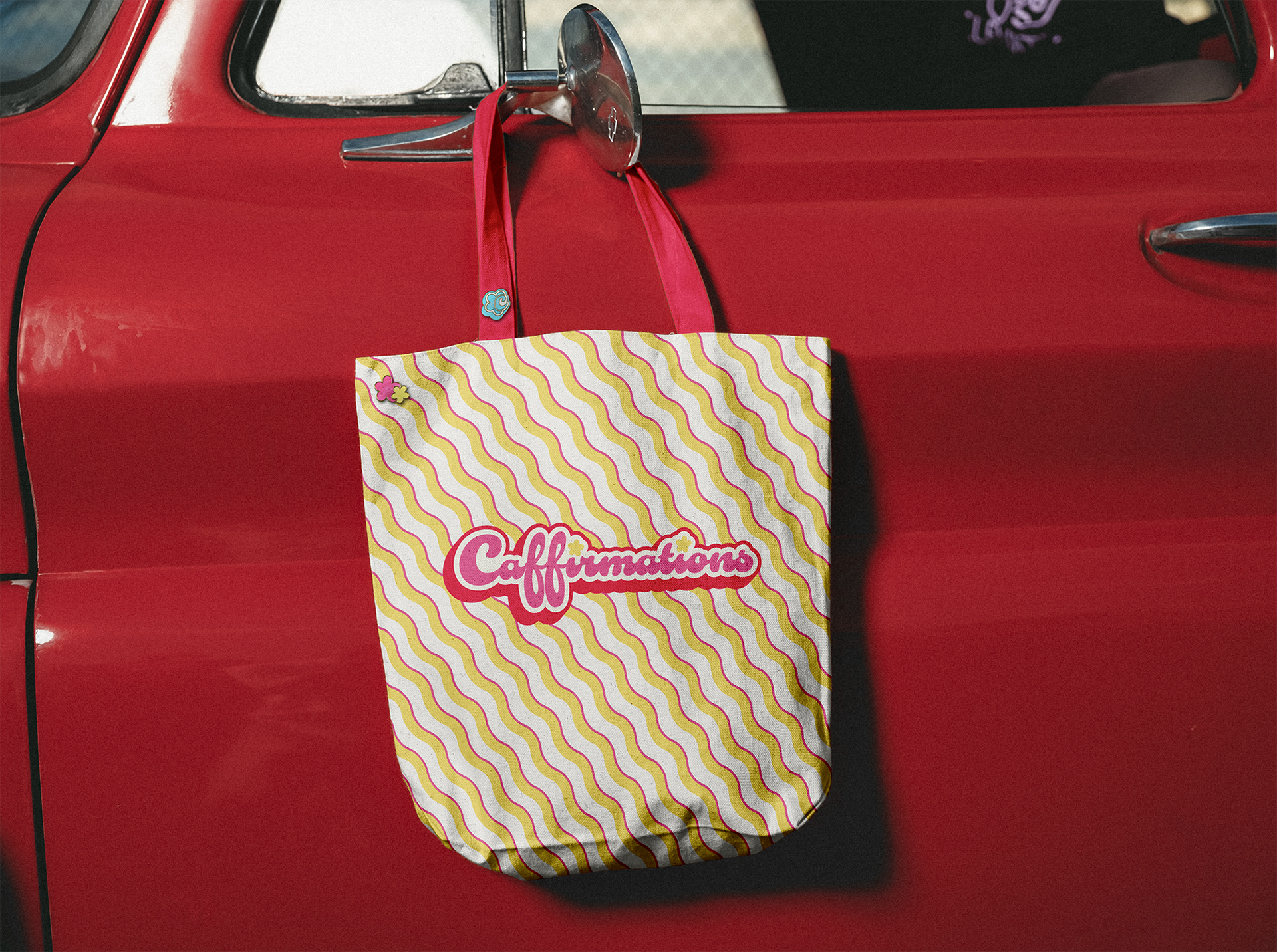
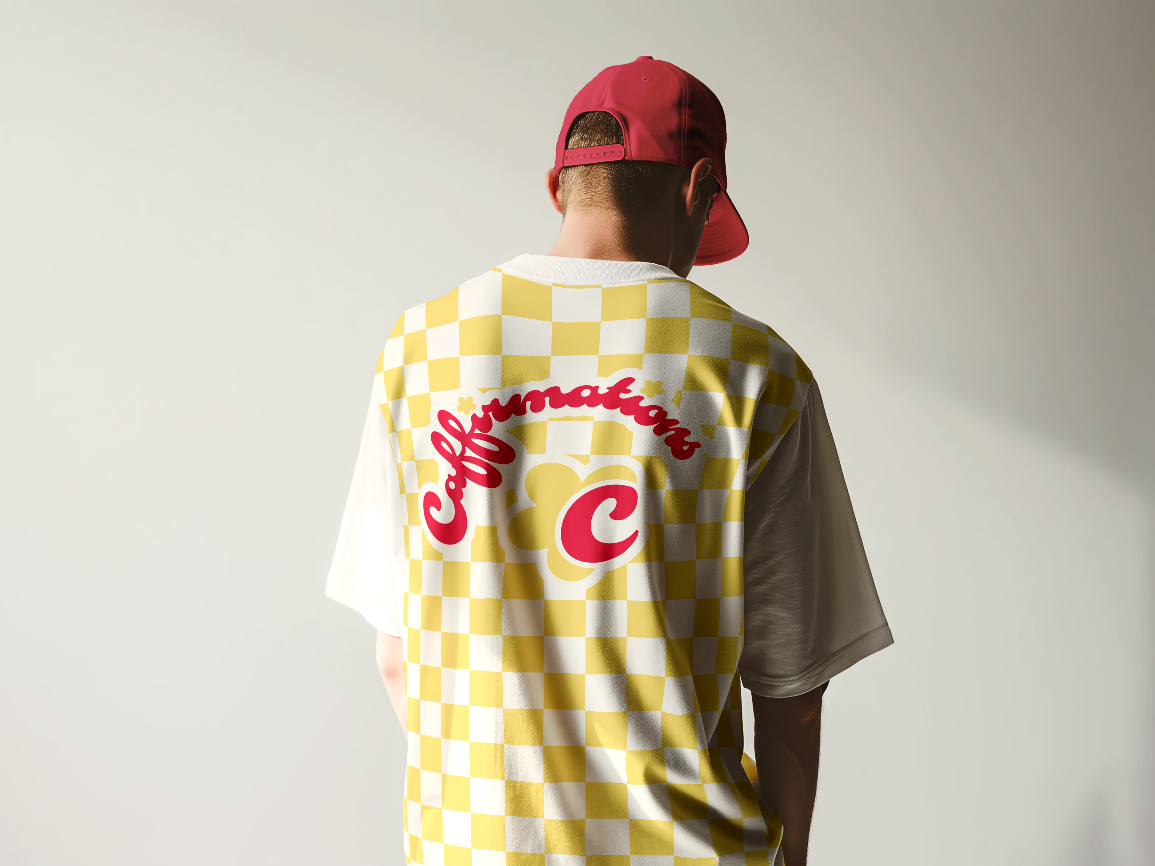
However, the team did have a clear vision from the start regarding their preferred colour palette. They were drawn to bright, energising hues that reflected the vibrant, feel-good nature of the brand. This provided a strong foundation to ensure the brand identity would feel fresh and dynamic from the outset.

Design Solution:
Design Solution: Through extensive typography research and multiple iterations, I created a logo suite that captured the essence of Caffirmations: empowering, vibrant, and adaptable. The final design ensures the brand can stand strong in any format, from horizontal to stacked or square layouts, while maintaining the energy and personality of the brand. The chosen color palette was incorporated to align with the uplifting spirit of the brand, enhancing its sense of joy and positivity across all visual assets.
To further strengthen the brand’s versatility, an icon was created specifically for small formats and social media platforms. This icon offers a simplified and easily recognizable version of the logo, ensuring the brand remains impactful and legible even in smaller spaces, while still conveying the essence of Caffirmations' vibrant and empowering energy.